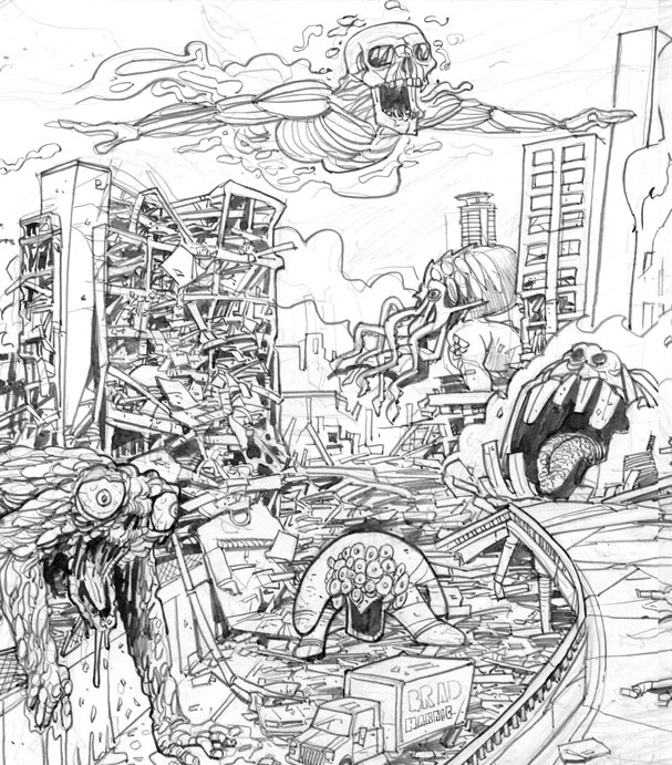
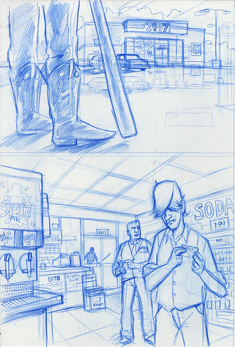
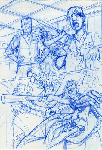
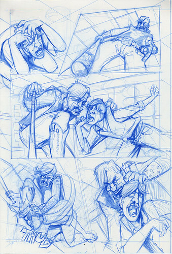
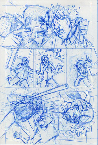
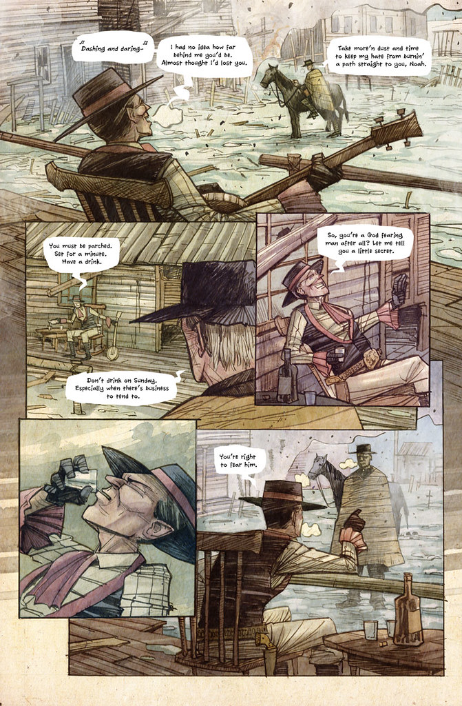
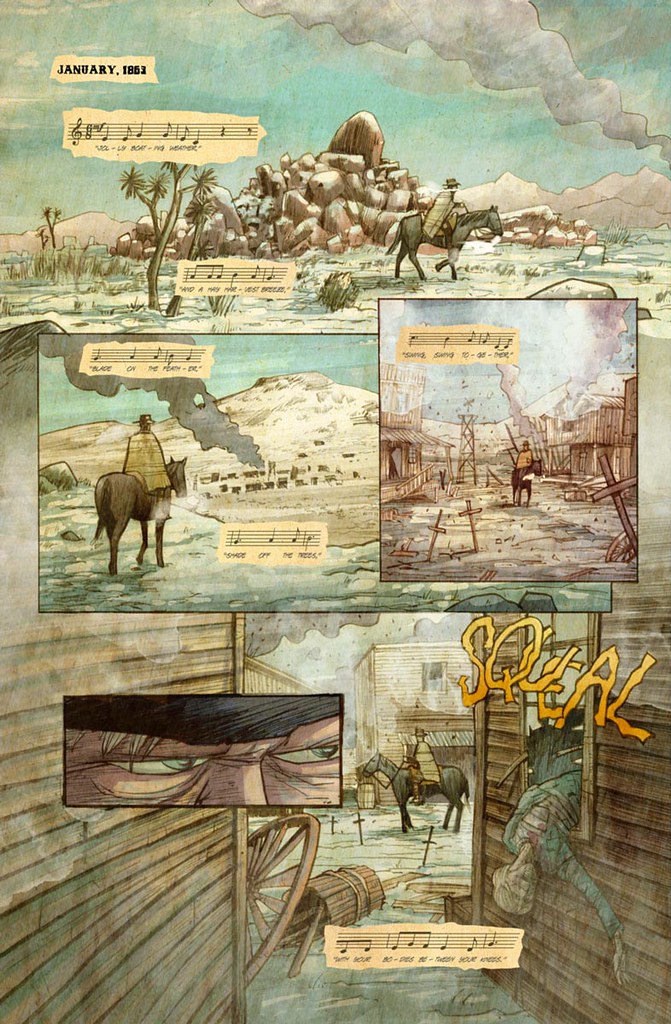
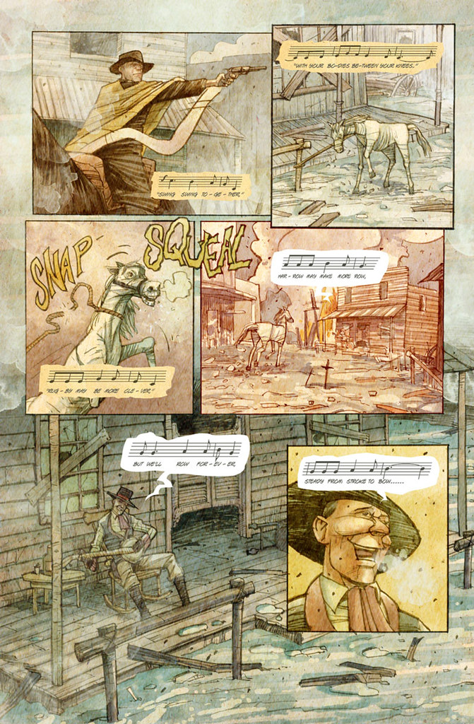
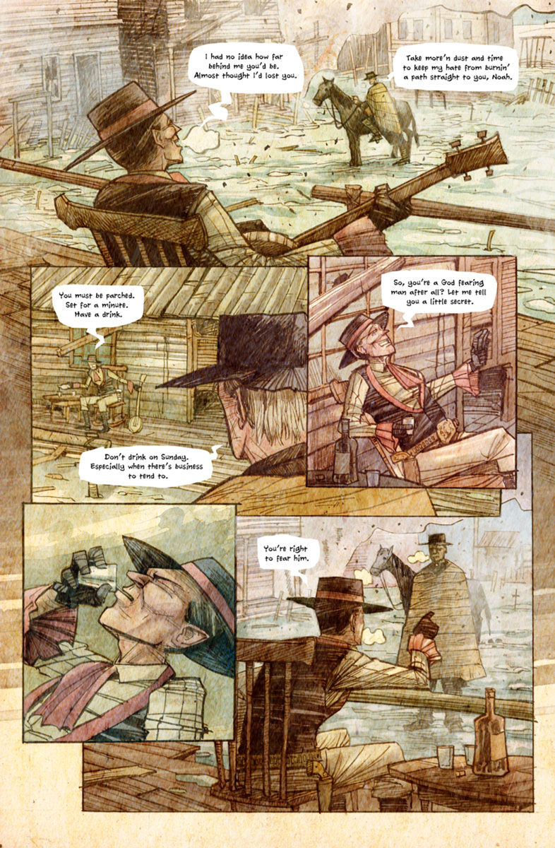
Sorry for lack of posts. Here's part of a page from something I'm working on:
Wednesday, November 16, 2011
Wednesday, October 26, 2011
Tuesday, October 25, 2011
Nightmare World: Frozen
Ok, it's been way too long between posts. I've recently started a rather demanding project that is eating up much of my reserve brain power. Anyway, I wanted to finish up with my NIGHTMARE WORLD art.
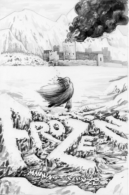
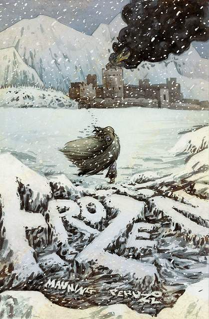
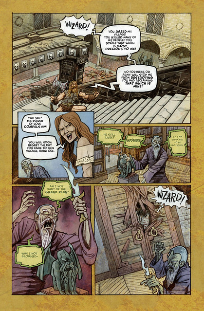
With NIGHTMARE WORLD VOL 3: Demon Days Dirk Manning gave me the opportunity to have TWO stories in the collection. He had already committed "Paranoid" to the volume (see last blog post) and approached me to "re-master" a story that had previously appeared on the web. That story was/is, FROZEN.
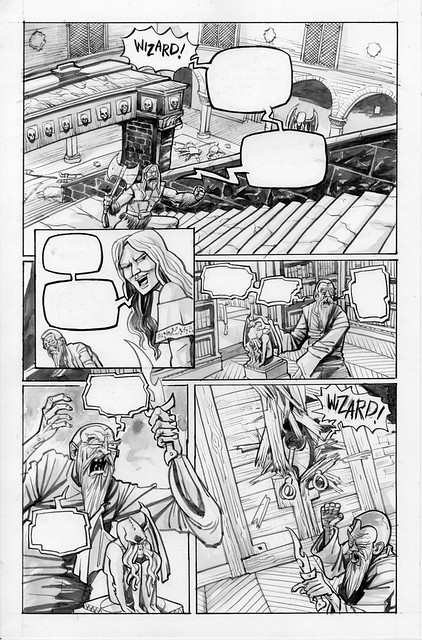
This was easily the most fun to draw. Who wouldn't want to draw barbarians chasing down mad wizards on top of a mountain?
You may notice I drew in the speech balloons right on the art. I had started doing this because computer lettering (specifically speech balloons) look so jarringly separate from the rest of the art. Some people are fine with this, but I think everything should look harmonious. If most of the art is drawn by hand, the balloons naturally should too.
Here are the two pieces colored:
If you want to read the whole thing, please pick up a copy of Nightmare World at the link above.
Thursday, October 6, 2011
Nightmare World Week(s): Paranoid
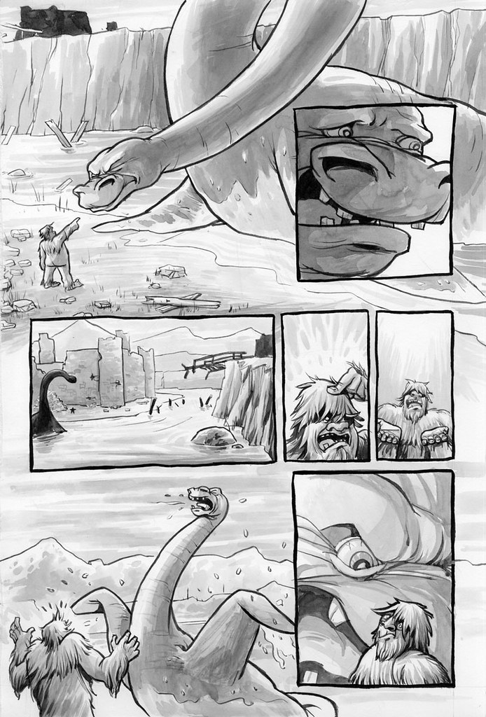
My next NIGHTMARE WORLD story was Paranoid. It took awhile for Dirk to convince me to do this story. The premise basically being a meeting between Bigfoot and the Lochness Monster. It sounded ridiculous and I guess that's the point. It was a humor story more than horror, so I had fun with it.
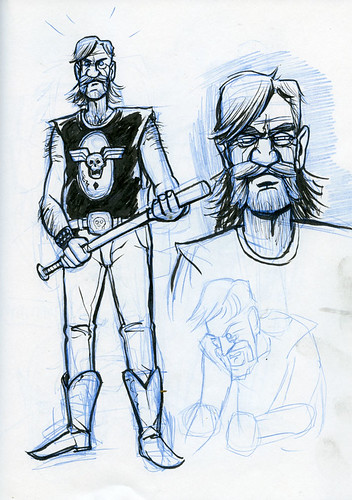
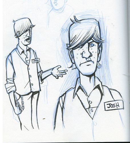
Many people have said my work is "cartoony" which I find a somewhat derogatory term when used in certain contexts. I think people are responding to my "exaggerations" which are used to help convey the emotions of the story or scene. With comedy, I tend to exaggerate features, anatomy, etc more for effect. Anyway here are some of the inkwash images I started with...
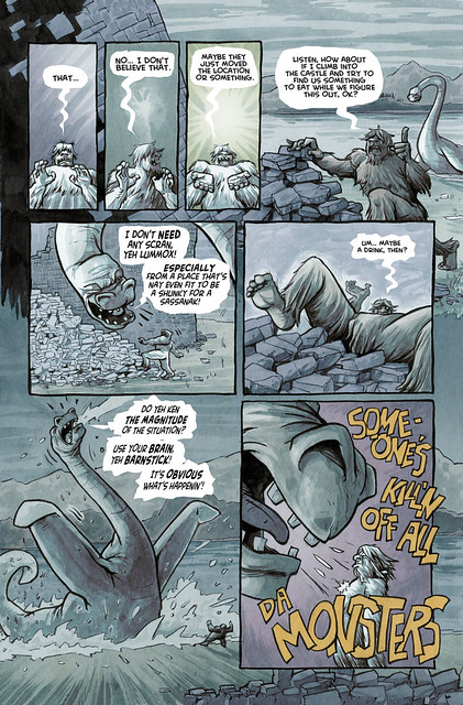
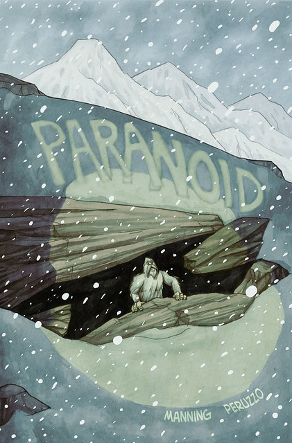
Dirk and I had many conversations about the color of this story. There are two scenes. One in the distant past, the other (concerning Bigfoot and his large companion) in the "present". Since Bigfoot and Nessie are fairly comical, my first instinct was to use a very colorful approach, and make the past scenes, more neutral. Dirk convinced me to switch the idea, since the "present day" is really after a holocaust of sorts. Here are some color versions along with the "cover" which is one of my favorite pieces I've done.
Please remember to purchase NIGHTMARE WORLD: DEMON DAYS, where you can read PARANOID in it's entirety.
Wednesday, September 28, 2011
NIGHTMARE WORLD week: The Guns of Love Disastrous
My second collaboration with Dirk Manning on NIGHTMARE WORLD marked a real turn artistically for me. I had just started playing with ink washes, but had meager results with how to color them. Actually the results were pretty bad. But I'm stubborn and convinced myself I'd find a way to make it all work.
I'll show off some of my ink work first. I had done 2 previous projects with this technique, but I feel this page is what turned the lights on for me.
one of my favorite pages:
So you can see, I'm fairly comfortable pushing the ink around the page. I remember reading a trade paperback of Jason Aaron's SCALPED at the time. Colorist Giulia Brusco had done a fill in story, coloring beautiful ink washes. Inspired, I played around with some photoshop settings to try to mimic what she had done. I'm not sure if she has a similar process, but I found what I wanted....
Obviously I've modified my process since then, and I'd probably color it different now, but I still look at this project as a key moment in my development as a comic book artist.
Please remember to order a copy of NIGHTMARE WORLD VOL 3 DEMON DAYS due out next week (October 5th).
Monday, September 26, 2011
NIGHTMARE WORLD week: making BREAK STUFF
So all this week I'll be posting about Nightmare World to celebrate the upcoming release of volume three in trade paperback. NIGHTMARE WORLD Vol 3 DEMON DAYS is available in comicbook shops (or onlie sellers) October 5th. All three volumes can be found here.
NIGHTMARE WORLD, if you didn't know, is the creation of Dirk Manning. I've worked with Dirk on several stories over the last few years, most being for this very anthology. I won't get too much into what it's all about, other than it is a horror anthology with a good mix of Twilight Zone and Tales From the Crypt. I really want to post more about art, so if you like what you see in these posts this week, please pick up a copy or three of NIGHTMARE WORLD. The volumes don't follow any particular order, so you can read them out of sequence.
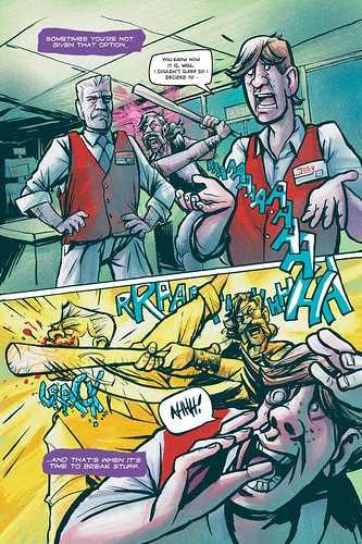
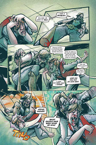
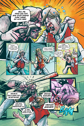
The first story Dirk wanted me to work on was "Break Stuff". I initially rejected the story, but after several arm-twistings, I relented. The following images are sketches and pencilled pages.
As you can see I was using blue pencil for the drawing stage. The drawings are a bit more detailed as well. My process changes from project to project, year to year. I traditionally inked this story with straight black ink, so the end result is more "traditional" then my more current work. a few colored examples are below.
The complete BREAK STUFF can be found in NIGHTMARE WORLD Vol 1 13 Tales of Terror
Thursday, September 22, 2011
My tools
One of the things I always want to know from other artists is what tools they specifically use. I've experimented with many over the years. Different papers, brush pens, erasers, I've tried them all. The pictures above are what I'm using now.
I'll start at the top. I use Higgins non-waterproof ink, but I never use it straight out of the bottle. Over the years I've grown to have a great distaste for flat black. This has to do mostly with my coloring process. Flat black never really looks right with my coloring process and rarely does the eye see complete natural black. There is always color to see even in darkness.
So I mix higgins with distilled water. Right now I have an "almost black" and a "light grey" mix. You can see one of the bottles right in the center.
To draw with ink, I use a brush. My absolute favorite is a number one Escoda Kolinsky Sable. It's the small blue brush in the picture. Most artists use a number 2, which is a larger, fatter brush, but I've found I can't get the control I can with a thinner brush (I've also used a number zero brush, but it really doesn't hold enough ink).
For pencils I use a 5H pencil. It is extremely hard lead, so the drawings are light. This means I don't have to erase much, if at all. Sometimes i'll add marks over the inks with a mechanical pencil as well.
For panel borders I use a fantastic wedge-shaped marker from Japan, a Sakura Pigma Sensei. I love it because I can vary the line width, but keep it much more consistent than a brush.
The last picture is my paper. I've tried many different brands and this is by far the best bristol I've worked with. This paper has a smooth side and a rough side. I use the smooth. This paper does not bleed and works great for dry brush effects. I just hope they don't change the formula or discontinue it like the last paper I was using.
Wednesday, September 21, 2011
Sketches part 2
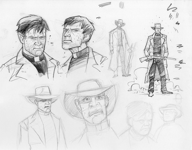
Ok, so sometimes I have a very clear idea what a character SHOULD look like, but when I get to drawing him/her, the result is a wild diversion. This is what happened with the character of The Pastor. The Pastor is supposed to be middle-aged, probably close to fifty. For some reason I drew him like this:
I pretty much rejected it right away, but kept drawing because, i dunno, I liked the result in an odd way. I think this is the first drawing I did when I actually started the process for Godstown. It was a good exercise in drawing a 'cowboy' to say the least.
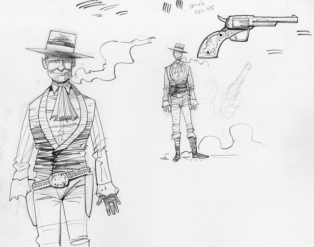
Jamie, the story's writer, had initially suggested the Pastor look like Spenser Tracy. I think when I drew the first image I was using a reference pic of Tracy, but he must have been too young (in the picture). I refocused and came up with these drawings:
While, the character has evolved to look a bit different (they always seem to do), this was the look I wanted.
I can't remember if I've ever drawn a horse before this project (I rarely draw animals). I definitely hadn't drawn the "Old West". This next sketch was to help me visualize what drawing style(s) I should be using.
Again, not exactly how the final "look" turned out, but a very useful drawing to get the feel I wanted. These were pretty much the only sketch work I did before starting. I'm not big on doing hundreds of sketches before a project as I much rather let the art evolve on the story pages. I did gather, literally hundreds of reference images through capturing still frames from movie westerns, but due to copywrite, I won't be posting any images from that collection.
Monday, September 19, 2011
Sketches
So, I'm a process junkie. I love to see how other artists do what they do and how they do it. One of my goals for the blog here is to show you some of that. Projects can really take a life of theit own and become something RADICALLY different than what you initially intended. Sometimes initial ideas are too grand, sometimes too limiting. Sometimes the process can take wild turns away from what you want. I'm rambling. Anyway, for GODSTOWN, things have gone pretty much in the direction I wanted, but as you'll see below, ideas were rejected, tweaked and refined.
I'll start off with the story's main "villain," Noah. The first draft of the script called for a "Roy Rogers" singing-cowboy-type of character, so that is where I started....
I'll start off with the story's main "villain," Noah. The first draft of the script called for a "Roy Rogers" singing-cowboy-type of character, so that is where I started....
Godstown is not really meant as a comedy. Noah is a very formable and dangerous character. After drawing this I felt it took too much away from his "dark side". So I saved some of the flair, but toned it down. Also i wanted him to look more dangerous. This was the result, which pretty much stays intact in the sequential pages:
That's all for today. I'll continue with more characters and sketches in the next post.... sometime this week.
Sunday, September 18, 2011
Process of a page
Thought I would post on what my art looks like through the stages. I am a one-man "band" when it comes to the art portion of my comic pages. I pencil, ink, color, and letter my pages (although I do have a project coming out sometime next year that i only did pencil and ink-- first time that has happened).
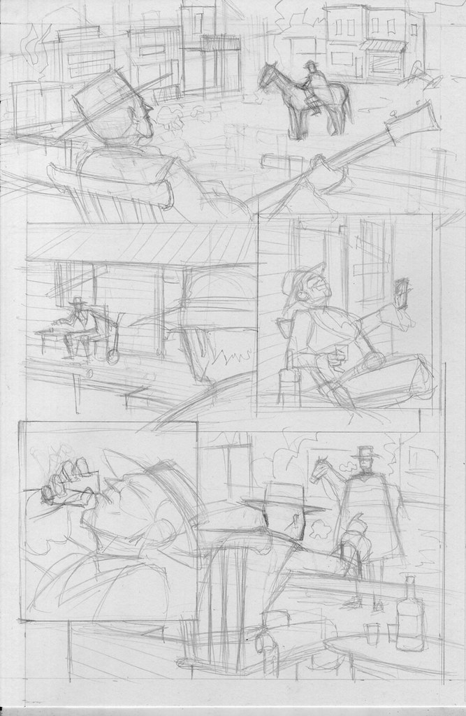
Penciling is probably my least favorite part of the project. I see pencils as pretty much the architecture of the drawing. Not much detail, mostly just placement and proportion. Here's a sample of one of the pages I previously posted:
As you can see, basically just outlines and structure to show me where everything is. Inking is much more enjoyable as this is where i feel more of the "drawing" happens. I don't use a "typical" inking process. My ink is diluted to a dark grey. I use a water-soluble ink, which allows me to create ink washes and grey tones. It's a much more "painterly" process than using flat blacks. Here's the ink stage of the drawing:
My coloring/lettering/digital process is not really easy to describe, so I think I'll do that in a later post. For now, here's the finished page:
Wednesday, September 14, 2011
GODSTOWN
So, my latest project is called Godstown. I'm working with writer, Jamie Cottle. Here's the basic premise:
"God has determined Man is inherently flawed, and needs to be recalled. Noah, heaven’s gunslinger, has been sent by God to cleanse humanity from the Earth. An elderly pastor has rejected his faith for his own code of ethics. His quest of revenge is the only thing standing in Noah's way."
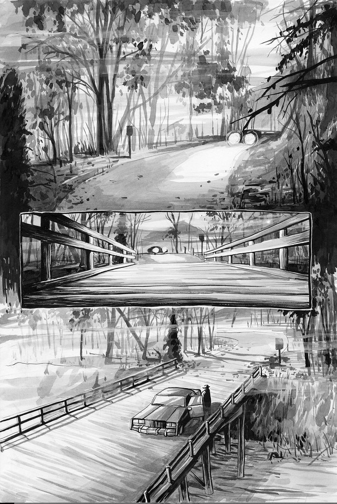
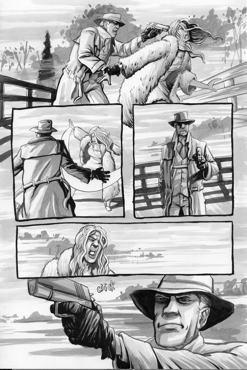
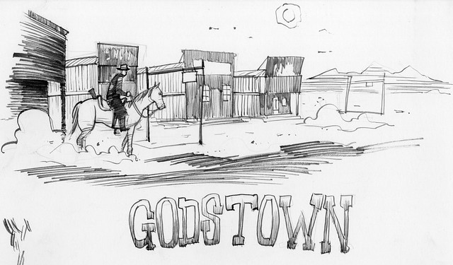
And here are a few teaser images:

Subscribe to:
Comments (Atom)
